Apple Touch Icon: Size, Setup, and Why You Need One
Everything you need to know about the apple-touch-icon — what it is, the right sizes, how to add the link tag, and how it differs from a standard favicon.
- favicon
- apple touch icon
- iOS
- web design
- PWA
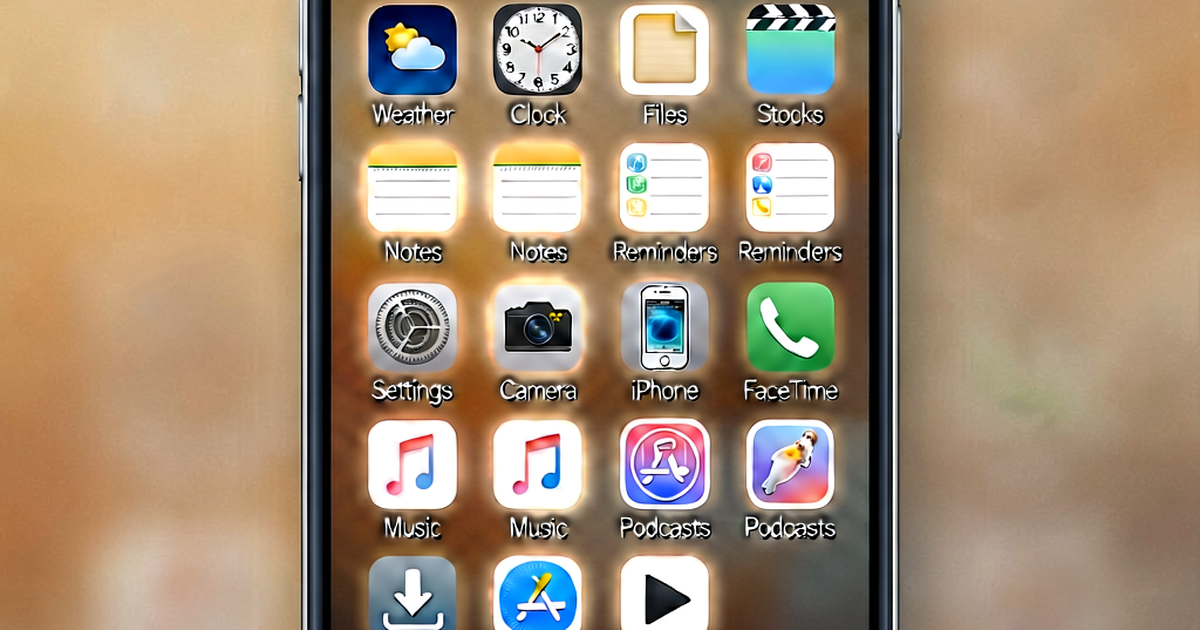
If a user opens your website in Safari on their iPhone and taps “Add to Home Screen,” what icon appears on their home screen? Not your regular favicon — a dedicated icon called the apple-touch-icon. If you have not set one up, iOS will generate a screenshot thumbnail of your page instead, which rarely looks good and signals that your site is not quite polished.
Setting up an apple-touch-icon is a small but meaningful step toward a professional web presence. Here is everything you need to know.
What Is an Apple Touch Icon?
The apple-touch-icon is a PNG image that Apple devices use when a user saves your website as a shortcut on their home screen. On iOS, this is triggered through Safari’s Share sheet — the user taps the share icon, then “Add to Home Screen.” The resulting icon looks and behaves like a native app icon on the device’s home screen.
The same icon is used in other Apple contexts:
- Safari on macOS: When a user pins a tab or adds a site as a Favorites shortcut, Safari can use the apple-touch-icon
- Spotlight search on iOS: When searching for apps and shortcuts, the icon appears in results
- App clips: Some progressive web app configurations use it as part of their icon set
The concept was introduced with the original iPhone in 2007, when Apple needed a way for websites to look intentional on a home screen full of native app icons. The format has remained essentially the same since — a plain square PNG, with Apple applying its own rounded corner treatment on display.
Required Sizes
Apple devices have varied in screen density and physical size over the years, which means different sizes are used in different contexts. The sizes that matter are:
180×180 (Primary)
This is the size you should always include. It covers modern iPhones with standard and high-density displays. When iOS scales it down for older or smaller contexts, it does so gracefully. If you only provide one apple-touch-icon, make it 180×180.
152×152 (iPad)
Standard iPad displays use 152×152. Retina iPads can scale up from this. If you want a pixel-perfect result on all Apple devices, include this size alongside 180×180.
120×120 (Older iPhones)
This covers older iPhone Retina displays. With the device landscape in 2026, the majority of active iPhones will pull the 180×180 version, but if you want comprehensive coverage, 120×120 is worth including.
How to Add the HTML Link Tag
The apple-touch-icon is declared in your HTML <head> using a <link> tag with rel="apple-touch-icon":
<!-- Single icon (covers most cases) -->
<link rel="apple-touch-icon" sizes="180x180" href="/apple-touch-icon.png">
If you want to serve multiple sizes:
<link rel="apple-touch-icon" sizes="180x180" href="/apple-touch-icon-180x180.png">
<link rel="apple-touch-icon" sizes="152x152" href="/apple-touch-icon-152x152.png">
<link rel="apple-touch-icon" sizes="120x120" href="/apple-touch-icon-120x120.png">
iOS reads the sizes attribute and picks the best match for the device. If no match is found, it defaults to the largest available size and scales it down.
File placement: You can place the file anywhere on your server, but the conventional location is your site’s root directory. Apple browsers will look for apple-touch-icon.png at the root even without an explicit HTML declaration — so having the file at /apple-touch-icon.png provides a fallback even if your <head> tag is missing. Explicit declarations always take precedence over this automatic lookup.
Key Design Differences From a Standard Favicon
The apple-touch-icon and your standard favicon serve related but distinct purposes, and the design requirements differ in a few important ways.
Use a Solid Background
Your regular favicon might use transparency, letting the browser’s chrome show through around the icon. The apple-touch-icon should not. Apple applies its own rounded corner mask and display treatment, and a transparent PNG will typically render with a black or white background depending on the OS version and context — which is almost never the intended result.
Use a solid, opaque background color that is part of your brand. The rounded corners will be applied by iOS automatically; you do not need to round them yourself.
Design for a Larger Canvas
At 180×180, you have many more pixels to work with than a 16×16 favicon. This means you can show more detail and your design can be closer to your full logo rather than a highly stripped-down glyph. Think of the apple-touch-icon as your site’s app icon — it should feel at home next to native app icons on the device.
That said, do not overcrowd it. App icons on iOS have consistent visual weight and generous padding. Leave breathing room around your central design element, especially toward the edges. The rounded corner treatment iOS applies will clip the corners, so avoid placing important elements in the extreme corners.
No Gloss Effect Needed
In iOS 6 and earlier, Apple would automatically apply a glossy sheen effect to home screen icons. That treatment was removed in iOS 7, and it has been gone for years. Do not design a glossy effect into your apple-touch-icon — just provide a flat, clean image.
Maskable Icons and the apple-touch-icon
If you are also setting up icons for Android and progressive web apps, you will encounter the concept of maskable icons. Android uses adaptive icons, which apply a device-specific mask (circle, squircle, rounded rectangle, and so on) to app icons. A maskable icon is designed with a safe zone — your main artwork sits in the central 80% of the image, and the outer ring is filled with a solid background color that can be safely clipped by any mask shape.
The apple-touch-icon is not a maskable icon in the Android sense — Apple handles its own masking independently. However, the principle of keeping important content away from the edges applies to both. Designing your icon with padding around the central element serves you well on both platforms.
If you use a favicon generator to create your icon set, it will typically generate separate files for the apple-touch-icon and for maskable Android icons. They share a similar design intent but are not identical files.
Testing Your Apple Touch Icon
To verify your apple-touch-icon is working:
- Open your site in Safari on an iPhone or iPad
- Tap the Share button (the square with an arrow pointing up)
- Tap “Add to Home Screen”
- Check that the icon shown in the preview matches your intended design
- Tap “Add” and verify the icon on the home screen
If you see a screenshot thumbnail rather than your icon, it means iOS could not find a valid apple-touch-icon. Check that your file exists at the declared path, that your <link> tag is in the <head> of the page, and that the PNG is not corrupted.
On a desktop browser, you can check that the file is being served correctly by navigating directly to the icon URL (e.g., https://yourdomain.com/apple-touch-icon.png) and verifying the image loads.
The Short Version
The apple-touch-icon is a 180×180 PNG with a solid background that iOS uses for home screen shortcuts. Declare it with a <link rel="apple-touch-icon"> tag in your <head>, place the file at your site’s root, and design it like an app icon — more detail than a favicon, clean background, breathing room at the edges. It takes five minutes to set up and makes your site feel intentional to every iOS user who saves it.
Related reading
-
Favicon Sizes: The Complete Size Guide for Every Browser and Device
A definitive guide to favicon sizes — from the original 16x16 ICO to Apple touch icons, Android PWA icons, and SVG favicons. Know exactly what to generate.
-
What Is a Favicon? The Tiny Icon That Does a Big Job
Learn what a favicon is, where it appears across browsers and devices, and why this small icon matters more than you might think for your brand.
-
How to Create a Favicon for Your Website (Quick and Easy)
Learn how to create a favicon from scratch or from your logo — including design tips, format choices, and exactly how to add it to your website's HTML.